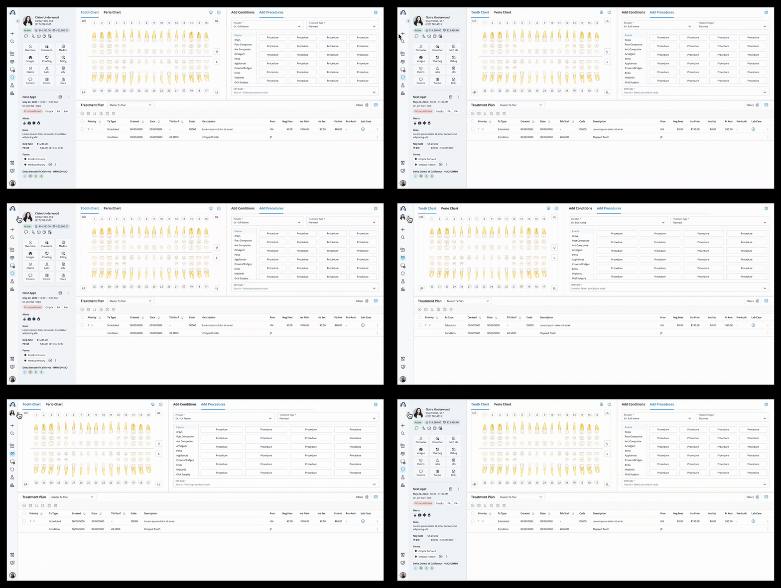
Archy Patient Snapshot

The Problem
Archy has been built around the goal of making the tasks in a dental clinic as efficient and easy as possible. Most of these tasks revolve around patients, so having all kinds of patient data easily accessible at all times is a top priority in the interface.
The initial designs had a patient module that would contextually appear on the schedule screen, but would not be present in other sections like Claims or Imaging. Some sections would have a top horizontal banner with some patient data, that wa inconsistent with the module on the schedule.


The interface as a whole needed a good upgrade, the top navigation bar was taking away precious real state and the abundance of padding between content blocks was also robbing space away and creating unnecessary visual noise.
We took a good look at some of the most successful and well designed SaaS interfaces and found a consistent quality among them. All of them were very streamlined, using a very minimal chrome, with no paddings between blocks and using the screen real state as efficiently as possible.

The Solution
The first task was to create a strong, unified patient module to be used across all patient related pages. All basic patient profile data is listed at the top, along with a photo, making it really easy to identify the patient.
Next, a patient status and billing balances are displayed, and then a grid with navigational elements to provide access to all patient sections.
At the bottom, a section that shows either the next appointment or the list of all appointments with all relevant data including time, provider, procedures, billing and insurance.

Each button on the navigational grid takes the user to the respective section while keeping the patient module consistently present until a different patient is selected either through the schedule or the patient directory/search.
As an additional way to surface data without disrupting the task flow, a preview is offered as a fly out panel for 3 of the patient sections: profile overview, insurance and medical history. This mechanism allows the user to get a glimpse of data from those sections without departing the current screen.

The Full Picture
Bold moves were made to streamline the interface. We got rid of all padding among the content sections, and completely removed the top bar. Every global function now is nested on the left bar navigation.

One consideration in making the patient module ever present was that some users performing some heavier tasks would at times prefer to use the whole real state of the screen to view a heavy table for example. So we devised a mechanism in which the patient module can be collapsed momentarily and expanded again when needed.

The Archy logo reveals a dropdown that hosts some of the global sections like Settings and Help, as well as the ID for the clinic and the employees list.

The avatar on the bottom of the main nav holds all user specific functions such as sign out, clock in/out and profile edit.

Patient search is also placed on the main nav bar and reveals a focused search module with recent items and suggestions.

